If you’ve lived in Singapore for a substantial amount of time, I’m sure you’ve driven past a black-and-white colonial house or two. It’s a colonial-chic fantasia that’s filled with character and cultural heritage – a dream home for many. However, one might have to set aside a considerable budget to live in one.
Drawing inspiration from our local PS.Cafe outlets and the Insight.Out Studio, homeowner Raj brought his vision of a black-and-white heritage home to life with the help of interior designer Roy. Here’s how they transformed a typical, dated flat to a stylish and functional home – you wouldn’t even think that it was once just a typical HDB unit.
Transforming a plain HDB unit into a spacious, colonial-chic home

Image credit: Raj
Built in 1975, this 3-room flat is located in the heart of Holland Village. It’s a small home with an old configuration that has separate toilet-shower areas. In conversation with Raj, he shared that the prime location and serene environment quickly sold him on the flat. In fact, soon after viewing it he snagged the flat just before Chinese New Year in 2021.
Thereafter, Raj and his interior designer, Roy, began their work on this quaint unit – transforming it into a stylish, yet spacious home while keeping to a budget of $60,000 for both renovation and furnishing.

Image credit: Roy Zhuang
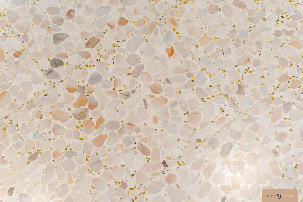
The HDB unit originally came with walls that had a cream finish and tall windows that gave Raj a great view of the surrounding foliage. The flat also had pink terrazzo tiles and peranakan-styled ventilation blocks – the homeowner actually fell in love with them and had these elements retained.

Image credit: Raj

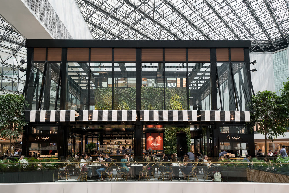
PS.Cafe blends both modern and vintage designs, and exudes a colonial-chic vibe.
Image credit: PS.Cafe
Other than retaining the essence of the original flat, Raj drew inspiration from the design of local PS. Cafe outlets and colonial black-and-white heritage houses. He also built the theme around some statement pieces of furniture he came across or even picked up over the years, including a hand-carved spindle mirror and an antique hardwood Chinese armchair.

Bali, Indonesia.
Image credit: @ms_netteleanne, @nature.art143
He also shared with us his love for travel, especially of his trips to Bali. Coupled with his work at the National Heritage Board, Raj injected his appreciation for Southeast-Asian culture and heritage into the design of his own home.

Singapore’s black-and-white colonial houses can be found in places like Wessex Estate. Image credit: JTC, @adriandoestheworld
From there, he worked with Roy to create an interior design moodboard. While Raj largely gave Roy the reins and the creative freedom with which to go about this project, the former loved the mood board and was appreciative of Roy’s professional input and suggestions. In this way, the two proceeded to bring their vision to life.
Overall, they went with a fusion of old and new, an aesthetic that spoke of oriental chic and snazzy boutique hotels. From jute rugs and rattan furniture to balinese decór and black-and-white tiles, this beautiful home is truly a far cry from your average HDB flat.
Reno bumps along the way
Of course, fusing both heritage and modern elements is easier said than done. For instance, finding ventilation blocks that matched the design of the flat’s original ones proved to be a tricky affair.

Image credit: Roy Zhuang
The pandemic was yet another bump in the road: it caused delays in the renovation project, including sourcing for materials and coordinating contractors. Various builders wound up testing positive every now and then, which meant that the flow of renovation works was unpredictable.
Despite these speed bumps along the way, Raj was eventually able to move in at the start of 2022.
Living and dining rooms where East meets West

Living alone has its perks, such as being able to hack down the walls of extra rooms that aren’t in use. That’s exactly what Raj did with one of two of his bedrooms – with his living room now in place of a spare bedroom, the flat could allow for more floor area for his dining room and hallway.
 If you take a closer look, you can see the brick-lining of the original walls.
Raj envisioned an Indo-Chine concept for the living room, furnishing the space with jute rugs and a muted-toned sofa from Cellini. To add to the laid-back atmosphere, Roy added a backlit feature wall to create an arch that softened the room.
Raj also played around with the arrangement of locally-sourced decór and memorabilia he used to decorate his oriental TV console. Many of them came from his travels overseas, especially Southeast Asian-style pieces such as the brass Buddha statues.

On top of the dim, warm lights installed in the flat, both Roy and Raj decided to go with black blinds to let in natural light for most of the day. With blinds, Raj could easily adjust the lighting of his home to create his desired ambience.

One of the elements that Raj chose to keep was the beige-pink terrazzo tiles that made up the flooring of the original flat. Not only does their timeless and whimsical appearance prick you with nostalgia, but they also inject a quirky, rosy hue into the otherwise muted flat.

Placed side by side, the kitchen and living room tiles perfectly represent the essence of 12hollandvillage.

How the original ventilation blocks looked like.


The new ventilation blocks used in the reno.
The homeowner also chose to retain the ventilation blocks that were embedded in the flat’s ceiling beams for their distinct pattern, which evoked nostalgia.

The dining room is another area where Raj incorporated both Eastern and Western elements. Whether it’s the curved marble table reminiscent of the Art Deco design style of the 1920s and 1930s, or the floor-to-ceiling mirror that had a frame full of spindles, Raj did a great job at using statement pieces to highlight each corner of the flat.


The Balinese-style cupboard showed off beautiful oriental motifs, while the rattan furniture and decór helped to seamlessly tie the design of the space together. Furthermore, Raj specifically made sure that the metal piping along the walls weren’t hidden – it served to add a small retro touch to the home.
Making their kitchen both functional and aesthetic
 The tall potted plant contributes to the tropical-resort, boutique-hotel look that the homeowner was trying to achieve.
Moving on to the kitchen, it might come to your attention that the entryway appears extra spacious. That’s because part of the facade was hacked to create an airy and seamless transition between the dining and kitchen spaces. In fact, the view of the kitchen from the front door is a view that Raj is extremely proud of having achieved with Roy’s help.

The mosaic tiles are used in the kitchen to add character and demarcate the space from the living quarters.

Another thing you can’t miss – the black-and-white marble and mosaic tiles that are unique and bold designs in their own right. With the black marble tiles laid as a border around the mosaic ones, Roy allowed both modern and vintage designs to stand out against each other. The pairing worked beautifully and captured the essence of a heritage home.

To go with the tiles, Roy went with a minimal, monochromatic look for the kitchen carpentry. The black built-in cabinets easily blended in with one another, making them both subtle and bold as an aesthetic feature in the kitchen.

Fun fact: the kitchen counters and cabinets were customised to accommodate the homeowner’s taller height.

The kitchen cabinets do a great job at keeping storage hidden away from plain sight, including the pantry and a washing machine. To add on to its clean, minimal look, Roy suggested concealed power sockets beneath the top cabinets instead of along the backsplash to make the worktop neater.
Uniquely-configured bathrooms that resemble that of a boutique hotel

Like many other HDB flats that were built in the 70s, Raj’s bathroom configuration separates the water-prone shower from the toilet with the vanity area situated in between the two on the outside. This large floating vanity dons a rattan-aluminium cabinet and a gold-rimmed mirror, making the bathroom area feel posh and grand.
Why not combine both spaces? Raj wanted to keep wet and dry areas of his house separate as much as possible, and this arrangement would ensure that the toilet was neat and dry.

Raj mentioned that the black louvre doors are made of aluminium – meaning they’re more durable than wood in the long run.
The green jade tiles, rattan vanity cabinet, and gold mirror gives the vanity a tropical yet luxe look. Coupled with the black louvre doors, these bathrooms almost look like they came out of a boutique hotel.

The teal kitkat tiles reflect light within the bathrooms, making it appear bright and airy. In fact, these tiles were one of Roy’s favourite elements of the flat.
Much of the bathroom walls are swathed in these teal kitkat tiles, which have a glossy, sophisticated sheen. The pair reached a common consensus that the bathroom fixtures should be kept to a minimum to enhance the feeling of spaciousness, resulting in recessed storage spaces to store toiletries and hidden piping.
Airy master bedroom with lots of natural light

Moving on to the master bedroom, it is evident that Raj kept to the black-and-white colonial theme of the house, relying on the terrazzo tiles to add a subtle pop of colour.
Speaking with Raj, he mentioned that he and Roy decided to tear down the wall between the master bedroom and kitchen. In its place, they installed a glass wall and extended the doorway to accommodate sliding fluted-glass panels. It’s a great choice of style – not only do they create the illusion of space, but they’re also aesthetic and provide privacy to the homeowner.

Like the fluted-glass panels, the floor-to-ceiling “window” allows one to take a peek into the master bedroom and ushers in natural light during the day.

This master bedroom is both aesthetic and functional, with lots of storage tucked away in the bed frame and wardrobe.

The golden handles give the room a luxe feel.
We noticed that like the kitchen carpentry, black wood was chosen for the master bedroom wardrobe. Not only does it create a bold contrast against the rest of the room, but it also seems to act as a feature wall for this black-and-white themed room.
A black-and-white heritage home in Holland Village

There’s something about moving out and creating a personal sanctuary out of your very first home. Maybe it’s the way that the 3-room flat always makes returning home feel like a therapeutic retreat. Of course, he had great help along the way – in the form of interior designer, Roy, from Insight.Out Studio.
When asked about any tips he wanted to share with other homeowners, this was Roy’s advice: trust in your taste and no home is impossible to achieve if you work together and have full trust in your interior designer.
Follow Raj and his beautiful heritage home at @12hollandvillage.
For more HDB transformations:
- Telok Blangah BTO that’s filled with bold colours, travel finds and a wall mural
- Trendy Hougang flat with Taobao furniture, terrazzo tiles
- Bedok resale flat that was transformed into a bright & airy home
Photography by John Lim.

Drop us your email so you won't miss the latest news.


