Aesop stores have long been the gold standard of commercial interior design. No two look the same – the golden-clad Aesop store in Raffles City is starkly different compared to the limewash-coated boutique in Ngee Ann City. Yet, despite their differences, they all possess a cohesive aesthetic that embodies what we know of Aesop as a brand.
When we chanced upon Jemaine and Deveyan’s home on Instagram, it dawned on us that the Aesop aesthetic could also work in a residential setting. After all, the couple was heavily influenced by wabi-sabi, a concept that is also often seen in Aesop stores.
 Image credit: Aesop
Together with Serene from INTR Studio – who also designed this bright and airy home in Bedok – Jemaine and Deveyan built a space that wouldn’t feel out of place in Aesop’s store directory. Here’s how you can get the same wabi-sabi vibes in your home if you’re embarking on a renovation project soon.
1. Limewash-painted walls & ceiling

One of the first things we noticed about Jemaine and Deveyan’s home was the limewash-painted walls. The technique has been rising in popularity as more homeowners fall in love with the natural, chalky texture that it offers. It is also something that is often used in Aesop’s interior design. In particular, the new Aesop store at ION Orchard features a similar textured paint on the walls, floors, and counter.
 The Aesop store at ION Orchard.
Image credit: Aesop
The couple spent around $4K-$5K covering their entire living room and kitchen with limewash paint; any more and they would have gone over their budget. One way to get the same look without breaking the bank is to DIY the whole process. It might be a lot more time-consuming, but it’ll free up your budget for other design elements in your home.
2. Brushed gold bathroom fittings

The first iteration of the Aesop ION Orchard boutique and Aesop Raffles City have iconic golden taps that make washing your hands at the store feel like a luxurious affair. Jemaine and Deveyan’s master ensuite gives the same kind of vibes.

All the fittings from the shower to the tap and even the bidet are all in a chic golden tone, while the matte finishing gives it an understated look so it doesn’t come across as gaudy.
 Aesop Raffles City.
Image credit: Aesop
Meanwhile, the KitKat tiles by the sink are another trending interior styling element, and is a design that prevails in Aesop’s Rue de Namur boutique.
 Aesop Rue de Namur.
Image credit: Aesop
3. Sleek lighting fixtures

Jemaine and Deveyan’s home doesn’t get much natural light coming in through the windows as it’s located on a lower floor and faces the neighbouring blocks. As such, good lighting design was crucial to ensure the home would not be shrouded in darkness.
To keep things neat and minimalistic, LED light strips were attached along the corner of the beams in the kitchen, gaming room, and bedroom. In the living and dining room, small recesses were created in the false ceiling for downward-facing ceiling lights.
However, what caught our eye was the exposed lamp in the kitchen.

The base of the lamp is a ceramic plate handcrafted by Yang Ce of Synceramic, while the light was installed by Likelights. From a certain angle, it looks like a mini Death Star shooting a laser beam out into space.

Other lights were Taobao acquisitions, like this hanging pendant lamp in the guest bathroom that complements the moon-textured mirror, also from Taobao.
4. Curved, walnut carpentry

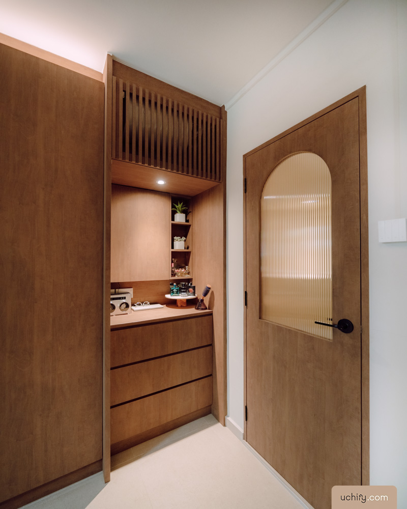
Another key design element of Aesop boutiques is the high-quality craftsmanship, in particular, the carpentry. The walk-in wardrobe in Jemaine and Deveyan’s master bedroom made us feel like we walked into the room where they keep all their other merchandise – using “storeroom” just doesn’t do it justice.

The walnut cabinets on the wall next to the bedroom have a seamless facade, and we’re loving the curved corners that remind us of Aesop’s Shibuya boutique. Not forgetting the recessed uplights that make the space look visually taller.

 Aesop’s Shibuya boutique has curved panels.
Image credit: Aesop
Outside in the living room, the entertainment centre is created to Deveyan’s exact specifications. A high-fidelity record player commands the majority of the carpentry, while a custom-made altar sits right next to it.

Look closely and you’ll also see that the hot water tank and air conditioner have also been tucked away behind fluted panels so as to not be a sore sight.
5. Recessed nooks & crannies with shelves

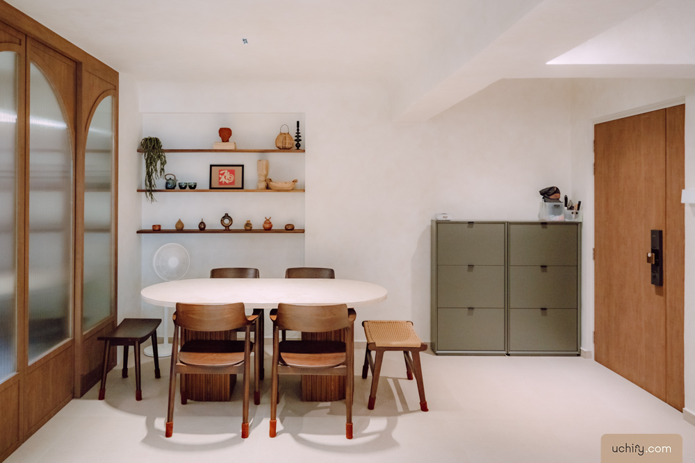
Shelving is a big part of Aesop for obvious reasons. But with so much built-in cabinetry, only one space is left for an open shelf, which is by the dining table.

Each wooden slab was sourced from Taobao and trimmed down by local carpenters so they’ll fit into the nook. We’d say it was a pretty nifty way of making the most out of this recessed space rather than filling it in to make it even with the rest of the wall. That would’ve cost a lot more whilst looking more boring.
6. A built-in settee to lounge in style

One of Jemaine and Deveyan’s must-haves during their house-hunting was ¾ windows as their dog, Coco, loves to people-watch. Once that was settled, the next step was to build a space for her to peer out the window at her leisure, and they decided on a settee spanning the length of the wall.
But rather than a standard straight bench, the settee sports a curved silhouette that brings a distinct look to the space when contrasted with all the regular-shaped beams on the ceiling.
 Aesop Oscar Freire.
Image credit: Aesop
The Aesop Oscar Freire boutique has a similar, undulating concrete slab smack in the middle of the store that’s home to sinks and product displays.
Bonus: Style your home with Aesop dupes

Let’s be real: Aesop is a bougie brand that can cost quite a fair bit. If you’d rather not splurge on the real deal, you can buy empty bottles on sites like Shopee and Lazada that look just the same but at a fraction of the cost. You can also fill it up with your favourite shampoo, conditioner, and shower gel too.
How to get the Aesop boutique look in your home

Armed with a budget of $120K and a timeline of 3 months, Jemaine and Deveyan transformed their 24-year-old resale HDB into a sleek, wabi-sabi home that could pass off as an Aesop store. While their brief to Serene was not to recreate an Aesop boutique, the couple’s design philosophy definitely aligned with the values of the global skincare brand.
You can follow them on their home journey at @ruo.home.
Check out other HDB resale renovations:
- A self-designed concrete jungle
- Modern Japanese apartment with onsen bathroom
- Scandi-boho renovation with just $25K
- Resale HDB outfitted with Taobao furniture
Photography by Brad Lee.

Drop us your email so you won't miss the latest news.


